MSGM Resort/Runway 2014
After a winter season where monochrome, leather and any form of denim have dominated street-wear, MSGM creative director Massimo Giorgetti has released his 2014 Resort collection that shouts down the monotonous tones of winter through playful and vibrant resort wear. A colourful collection that would make any Melbournian crave the summer months for an excuse to layer colour and print over one another, Giorgetti has tempered the feminine aesthetic of his designs with endearing tomboy touches.
Boasting high necklines and relatively short hemlines, Giorgetti delivers a more than respectable nod to the Sixties, with his use of neon hues and floral prints further encapsulating the iconic era.
Of the highlights is a neon yellow print made into a simple A-line shift, a glaringly Sixties -inspired piece that manages to exude relevance to today’s trends and a state of being contemporary while still remaining loyal to the era of inspiration.
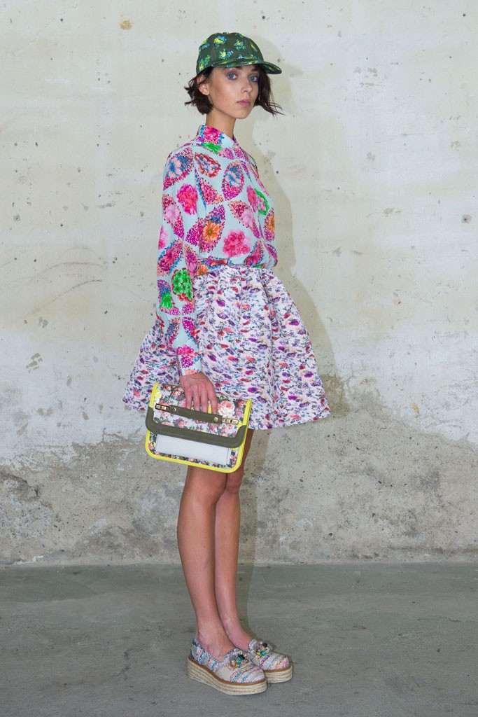
The collection stays true to its reputation of teaming bold prints in vibrant colours with contrasting textures in a striking floral shirt and puffy skirt combination. The digital-printed floral shirt combined with a similarly printed puffy skirt extols how effortlessly print and print can be combined to produce a striking summer combination.
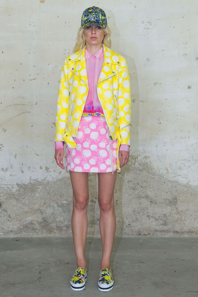
The strong, structured garments are a kaleidoscope of colour and print and are able to instantaneously catch the interest and attention of the public. This is no more evident in a yellow and white printed biker jacket that is combined with a flowing floral dress that perfects the balance between tomboy and girly.
What’s left? Well, you’ll find printed and floral caps, or the perfect coral blue or (surprise, surprise) colourful printed clutch to accessorise any of the arresting combinations.
More than anything, these supremely wearable pieces are a tribute to the exciting nature of resort style, where quirkiness is celebrated over safety and where colour triumphs over the monochrome tones of winter. After all, what could be more exciting than the clash of colour and print over the clash of colour and print?
Photos by Davide Maestri


Leave a Reply